


The contact page is one of the most visited pages on any business website — and one of the most neglected. Visitors who make it to your contact page are warm leads. They've seen enough to be interested and they're ready to take the next step. What happens on that page determines whether that momentum converts into a real conversation or quietly evaporates. Most businesses treat the contact page as an afterthought. The ones that treat it as a conversion opportunity consistently get more leads.
1. Make it impossible to miss
The first mistake is burying the contact page. If a visitor has to hunt through your menu or scroll to the footer to find how to reach you, you've already created friction that works against you. Your contact page should appear prominently in your main navigation — typically as the last item, where visitors naturally expect to find it. On mobile, it should be equally easy to locate. Some businesses go further and include a persistent "Contact Us" or "Get a Quote" button in their header that stays visible as visitors scroll. For service businesses where contact is the primary conversion goal, this is often worth the visual investment.
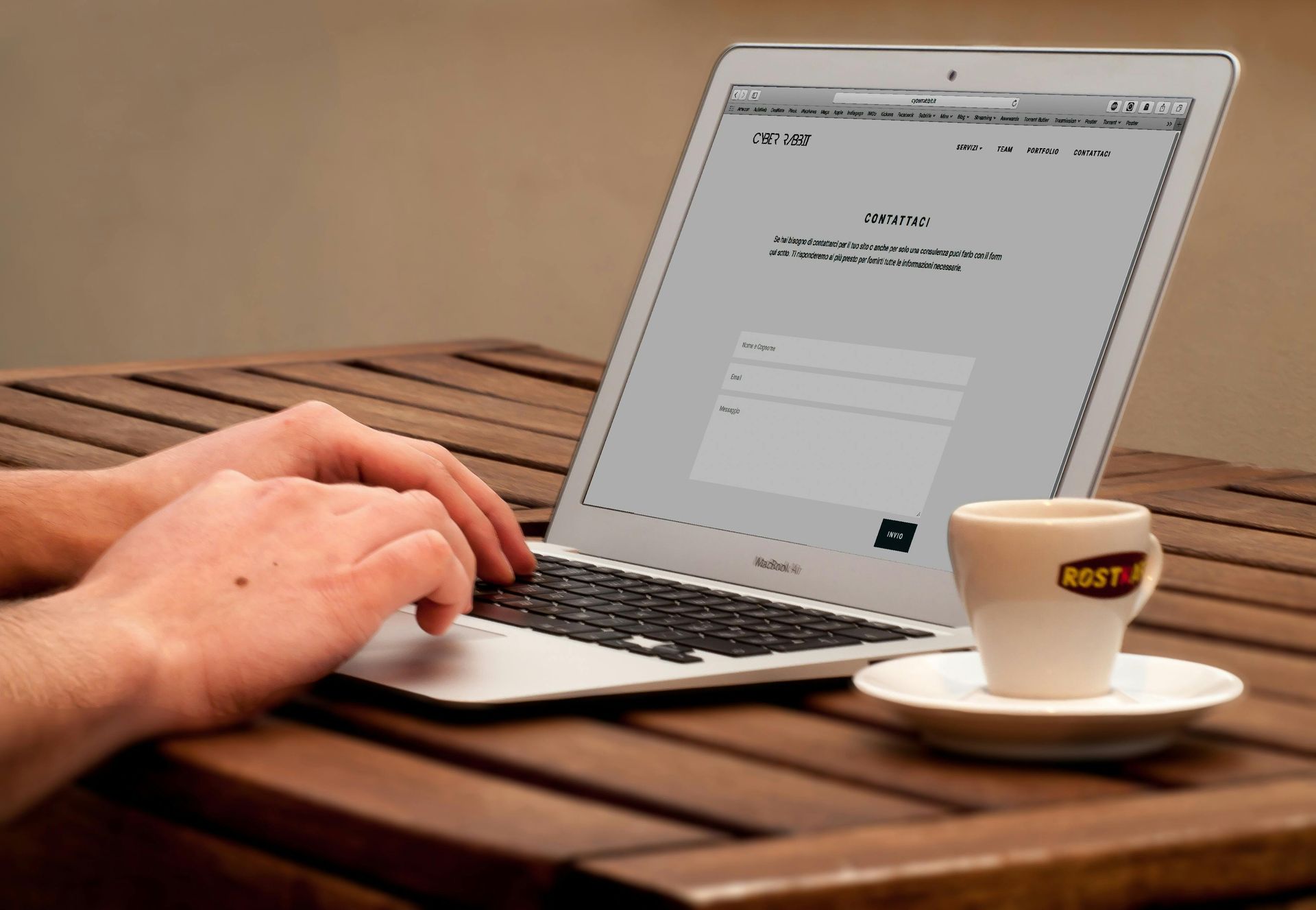
2. Give people options
Different customers prefer different ways of reaching out. Some want to call. Some prefer email. Some want to fill out a form. Some will use live chat if it's available. A great contact page offers multiple channels without overwhelming the visitor — a phone number, an email address, and a contact form covers most preferences. If you have a physical location, include your address and a map embed so visitors can verify you're real and local.
Phone numbers matter more than most digital-first businesses expect, especially for local service businesses. Seeing a real phone number with a local area code builds immediate trust. It signals that there's a real person behind the website. Even if most of your inquiries come through the form, the phone number's presence reassures visitors who might otherwise hesitate to reach out at all.
3. Keep your form short
Long contact forms kill conversions. Every additional field you add to a form is a reason for a visitor to abandon it. For most small businesses, the ideal contact form has three to five fields: name, email, phone (optional), and a message or dropdown asking what they need help with. That's it. If you're tempted to add fields for budget range, timeline, how they heard about you, and their company size — resist. You can get that information in the first conversation. Your goal right now is just to get them to reach out.
Make sure the form actually works — test it regularly, confirm submissions trigger a real response or at least an acknowledgment email, and check that form notifications aren't going to your spam folder. A surprising number of small businesses lose leads because their contact form silently fails and they never know it.
4. Set expectations and build confidence
Telling visitors what happens after they submit the form reduces anxiety and increases conversions. "We respond to all inquiries within one business day" is a simple line that removes uncertainty and builds confidence. Include a brief statement about what the next step looks like — a phone call, a free consultation, a quote — so visitors know exactly what they're signing up for. The more predictable and low-stakes the next step feels, the more likely they are to take it.
Social proof near your contact form also helps. A short testimonial, a Google review rating badge, or a simple line like "Trusted by 50+ Rhode Island businesses" reinforces that reaching out is a safe and smart decision. At the moment a visitor is deciding whether to submit the form, a reminder that other people like them have made the same choice — and been happy with it — can be the nudge that converts hesitation into action.
Conclusion
Your contact page is the last door between a potential customer and a real conversation with your business. Make it easy to find, give people multiple ways to reach you, keep the form short, and set clear expectations. These aren't complex changes — but they're the kind of improvements that can meaningfully increase the number of leads your website generates without changing anything else.
At Phase 7 Digital, every website we build is designed with conversion in mind from the first page to the last. Reach out to us today to talk about how we can help your site work harder for your business.
Let’s Grow Together
If you’re ready to take your business to the next level, contact us today. Our team of digital marketing experts in Providence is ready to create a strategy that works for you.